专业做国际网站平台营销
最近学习vue3.2并自己在写一个项目,然后发现好几个页面都是列表页,重复写table和column也是觉得累,学习的项目列表页不算多,要是公司项目就不一样了,所以就想着自己封装一个table组件,免去大量重复工作和copy改改改。
本文也是仅仅封装了一个相对简单的table组件,主要是table + 分页,要是不想要分页,也是可以通过使用table组件穿参数控制是否展示分页。基于查询表单,后续再安排~
封装一个table组件并不难,主要是搞懂插槽、作用域插槽的写法和用法,下面先复习一下插槽,再进行封装。
一、slot插槽
定义
Vue 实现了一套内容分发的 API,将 元素作为承载分发内容的出口。
简单理解:就是对子组件的扩展,通过 插槽向子组件内部指定位置传递内容。
插槽是组件的一块HTML模板,这块模板显示不显示,怎样显示是由父组件来控制的,而插槽在哪里显示就由子组件来进行控制。
分类
- 匿名插槽
- 具名插槽
- 作用域插槽
匿名插槽
它不用设置名称属性,可以放置在组件的任意位置;可以理解为父传入样式及内容,子负责展示
<!--index.vue-->
<Child ><ul><li>1</li><li>2</li></ul><ul slot><li v-for="(v,i) in arr" :key="i">{{v}}</li></ul>
</Child><!--child.vue-->
<!--匿名插槽-->
<template><div><slot></slot></div>
</template>
具名插槽
插槽加了名称属性,就变成了具名插槽。 在 v-slot 之后添加冒号 (:) ,然后写出要传递内容的 slot 的名称(v-slot:slotname);简写:#slotname
<!--index.vue-->
<Child><template #default> <!--指定了 default 的名称,表示不需要为默认插槽指定名称;--><p>我是main的内容</p> </template><template #header><h2>艾梯哎教育</h2></template><template #list><h2>列表展示</h2><ul><li v-for="(v,i) in arr" :key="i">{{v}}</li></ul></template>
</Child><!--child.vue-->
<!--具名插槽-->
<slot></slot>
<slot name="header"></slot>
<slot name="list"></slot>
作用域插槽
好理解的叫法:带数据的插槽。
作用域插槽跟单个插槽和具名插槽的区别,因为单个插槽和具名插槽不绑定数据,所以父组件提供的模板一般要既包括样式又包括内容,而作用域插槽,相当于父组件提供一套样式,数据都是子组件的。
<!--index.vue-->
<Child ><template #user="obj"><h2>老师:{{ obj.user.username }}</h2> <h2>所授课程:{{ obj.user.course }}</h2></template><!--解构写法--><template #user="{user}"><h2>老师:{{ user.username }}</h2> <h2>所授课程:{{ user.course }}</h2> </template><!--解构别名--><template #user="{user:person}"><h2>老师:{{ person.username }}</h2> <h2>所授课程:{{ person.course }}</h2> </template></Child><!--child.vue-->
<template><div><slot name="user" :user="user"></slot> </div>
</template><script setup>
import {ref,reactive} from 'vue'
const user = ref({id:1,username:'张老师',course:'vue'});
</script>
二、封装table
理解了具名作用域插槽 之后,相信大家脑海里已经有思路如何封装了。我这里的思路大概如下:
- 接收tableData数据和columns列以及其他杂七杂八的配置项;
- 然后在el-table-column上循环columns列;
- 然后定义以列名为名称的插槽,并将数据row传递出去;
- 并提供默认插槽内容,当没特殊数据展示,可不传父的内容,直接使用 定义的默认内容;
- 如果 columns传入fommater,则会根据传入的function进行转换数据。
具体实现如下:
<!--MyTable-->
<template><div><el-table :style="{ width: '100%' }"ref="elTableRef":data="tableData" :height="height" :max-height="maxHeight":stripe="stripe":row-key="rowKey":highlight-current-row="highlightCurrentRow"@row-click="handleRowClick"@selection-change="handleSelectionChange"><el-table-column v-for="item in columns" :key="item.prop":prop="item.prop" :label="item.label":show-overflow-tooltip="item.showOverflowTooltip":width="item.width":fixed="item.fixed":type="item.type":sortable="item.sortable":selectable="item.selectableFn"><!-- type 对应列的类型。 如果设置了selection则显示多选框; --><!-- 如果设置了 index 则显示该行的索引(从 1 开始计算); --><!-- 如果设置了 expand 则显示为一个可展开的按钮--><!-- selection / index / expand --><template #default="{row, column, $index}" v-if="item.type==='index'">{{getIndex($index)}}</template><template #default="{row, column, $index}" v-if="!item.type"><!-- 具名作用域插槽 --><slot :name="item.prop":slotProps="row":index="$index"><!-- 默认内容,当父组件不传内容时默认显示该内容 --><span v-if="item.formatter">{{ item.formatter(row[item.prop]) }}</span><span v-else>{{ row[item.prop] }}</span></slot></template></el-table-column></el-table><div class="pagination-wrap"><el-paginationv-if="hasPagination"v-model:current-page="currentPage"v-model:page-size="pageSize":page-sizes="pageSizes":small="small":background="true":layout="layout":total="total"@size-change="handleSizeChange"@current-change="handleCurrentChange"/></div></div>
</template><script setup>
import {toRefs} from 'vue'
const props = defineProps({// 表格相关tableData: {type: Array,default: []},columns:{type: Array,default: []},height: {type: String,default: '500px'},maxHeight: {type: String,default: '500px'},stripe: {type: Boolean,default: true},rowKey: {type: String,default: 'id'},highlightCurrentRow: {type: Boolean,default: true},//  分页相关hasPagination: {type:Boolean,default: true},total: {type: Number,default: 0},currentPage: {type: Number,default: 1},pageSize: {type:Number,default: 10},pageSizes: {type: Array,default: [10, 20, 50, 100, 200]},layout: {type: String,default: 'total, sizes, prev, pager, next, jumper'},small: {type: String,default: 'small'}
})let {tableData,columns,height,maxHeight,stripe,rowKey,highlightCurrentRow,hasPagination,total,currentPage,pageSize,pageSizes,layout,small
} = toRefs(props)const emit = defineEmits(['rowClick','selectChange','changeTableData','update:currentPage','update:pageSize'])
// 当某一行被点击时会触发该事件
const handleRowClick = (row, column, event) => {emit('rowClick', { row, column, event })
}
// 当选择项发生变化时会触发该事件
const handleSelectionChange = (selection) => {emit('selectChange', selection)
}// 每页条数变化的事件
const handleSizeChange = (val) => {emit('update:pageSize',val)emit('changeTableData', currentPage.value, val)
}
// 当前页码变化的事件
const handleCurrentChange = (val) => {emit('update:currentPage',val)emit('changeTableData', val, pageSize.value)
}const getIndex = (index)=> {return index + 1 + (currentPage.value - 1) * pageSize.value
}</script><style lang="scss" scoped></style>
三、使用MyTable组件
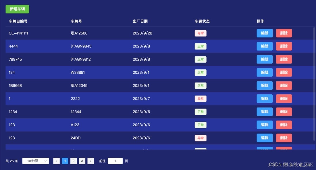
因为check需要格式化内容并且用el-tag来进行展示内容,所以此处向table组件传入了需要展示的内容,此时,向table的name=check的插槽传入内容,那么table组件的默认展示内容则失效。
同理,由于每个taable组件的操作项也不一样,所以此处向name=operator的slot插入内容。
<MyTable :tableData="tableData":columns="columns":total="total":currentPage="listQuery.pageNo":pageSize="listQuery.pageSize"@changeTableData="changeTableData"><template #check="{ slotProps }"><el-tag class="ml-2" :type="slotProps.check?'success':'danger'">{{ checkFilter(slotProps.check) }}</el-tag></template><template #operator="{slotProps}"><el-button type="primary" @click="setData('edit',slotProps)">编辑</el-button><el-button type="danger" @click="handleDel(slotProps)">删除</el-button></template>
</MyTable><script setup>
import { ref,onMounted } from 'vue'
import MyTable from '@/components/table/index.vue'
import useHooks from '@/hooks'const { checkFilter, dateFormate } = useHooks()let listQuery = ref({pageNo:1,pageSize: 10
})
const tableData = ref([])
let total = ref(0)/*** prop:数据项列名* label:列名展示名* fixed:固定列 true/right/left* width:列宽* show-overflow-tooltip* type:对应列的类型 selection / index / expand* sortable:true/false* selectable:Function* formatter:格式化内容 function(row, column, cellValue, index)
**/
let columns = ref([{prop: 'number',label: '车牌自编号'},{prop: 'numberplate',label: '车牌号'},{prop: 'date',label: '出厂日期',formatter: dateFormate},{prop: 'check',label: '车辆状态'},{prop: 'operator',label: '操作',fixed: "right"},
])onMounted(() => {getCarList()
})const changeTableData = (pageNum,pageSize) => {listQuery.value.pageNo = pageNumlistQuery.value.pageSize = pageSizegetCarList()
}// 列表查询
async function getCarList() {const {data: {data}} = await carList(listQuery.value)tableData.value = data.listtotal.value = data.rows
}</script>
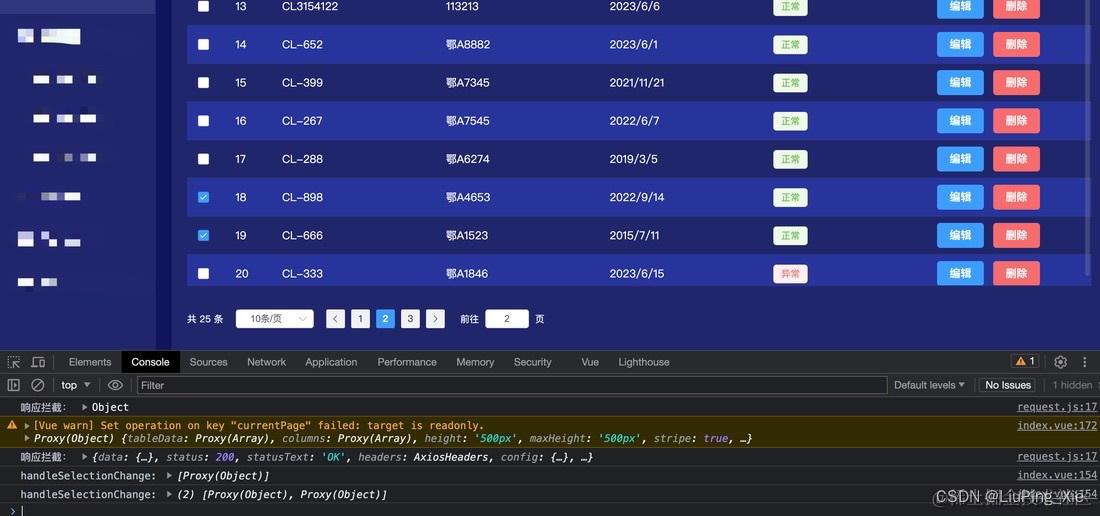
效果如下:
 如果需要加上索引或者复选框,需要在columns上添加上
{type: 'selection',label:'',width: '50px'},{type: 'index',label:'序号',width: '60px'},
若是列项超长不需要tooltip,则配置showOverflowTooltip为false(默认是true)
{prop: 'number',label: '车牌自编号',showOverflowTooltip: true, width: '100px'},
 到此一个talbe组件就封装完成,如有不当的地方还请大家多多包含和赐教!如大家有不一样的封装思想也多多留言交流,互相学习互相进步。